5.4 — Modern Input Types & Mobile Hints
Beyond simple text boxes, modern HTML provides native date pickers, color wheels, range sliders, and sophisticated selection controls – all without a single line of JavaScript. Paired with mobile‑specific hints, you can tailor the on‑screen keyboard, accelerate data entry, and eliminate input errors.
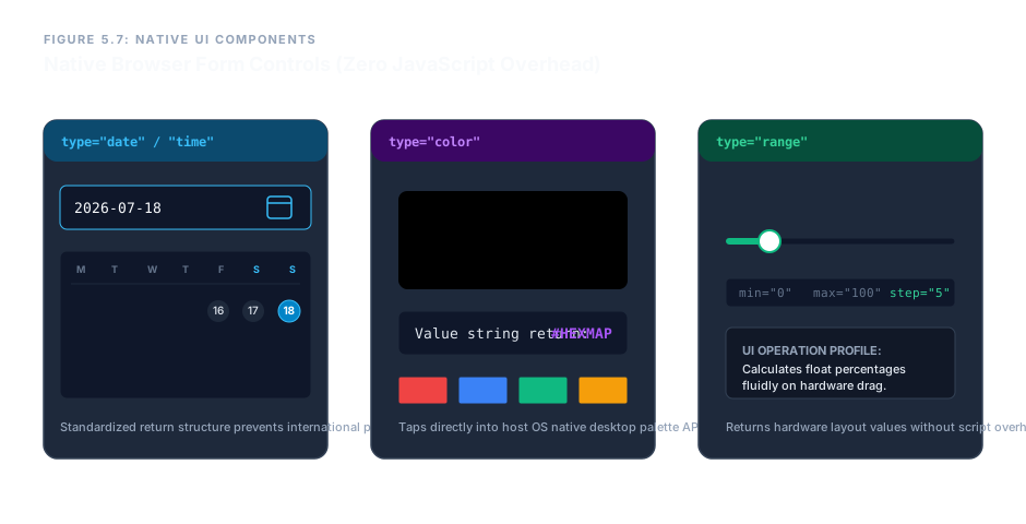
Chronological, Color & Fluid Selection Controls
date – Calendar Date Picker
Spawns a native calendar popup. The returned value is always YYYY-MM-DD, preventing regional date corruption.
<input type="date" name="schedule">
datetime-local – Date and Time
Combines a date picker with a time spinner in one control. Returns a string like 2026-07-13T14:30.
<input type="datetime-local" name="appointment">
month, week, time – Isolated Temporal Selectors
month returns YYYY-MM; week returns YYYY-Www; time returns HH:MM (24‑hour). Each opens its own native UI.
<input type="month" name="archive">

                <input type="week" name="fiscal">

                <input type="time" name="backup">
color – Native Color Picker
Opens the operating system’s color wheel. Returns a 7‑character hex string like #ff5733.
<input type="color" name="theme">
range – Fluid Slider Bar
Renders a horizontal slider. Use min, max, and step to bound the value. The exact number is not displayed by default – pair it with a label or output element.
<input type="range" name="capacity" min="0" max="100" step="5" value="30">
State‑Based Selection: Checkboxes & Radio Buttons
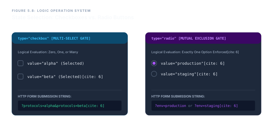
checkbox – Multiple Choice
Use when the user can select zero, one, or many options. All checkboxes in a group share the same name attribute. Each must have a unique value. Add checked to pre‑select.
<input type="checkbox" name="protocols" value="alpha" id="chk-a" checked>
<label for="chk-a">Protocol Alpha</label>
<input type="checkbox" name="protocols" value="beta" id="chk-b">
<label for="chk-b">Protocol Beta</label>radio – Single Choice
Use when exactly one option must be chosen. All radio buttons in a group share the same name; selecting one automatically deselects the others. Each has its own value.
<input type="radio" name="env" value="production" id="rad-prod" checked>
<label for="rad-prod">Production</label>
<input type="radio" name="env" value="staging" id="rad-stage">
<label for="rad-stage">Staging</label>Autocomplete Suggestions with <datalist>
A <datalist> provides a dropdown of suggestions for an <input> without restricting the user to those choices. Link them with the list attribute on the input and a matching id on the datalist.
<input type="text" name="region" list="region-options">
<datalist id="region-options">
  <option value="US-East">
  <option value="EU-West">
  <option value="AP-South">
</datalist>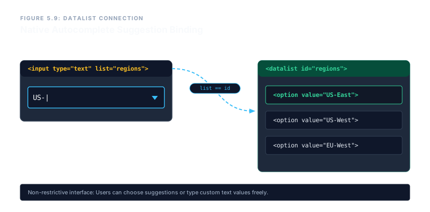
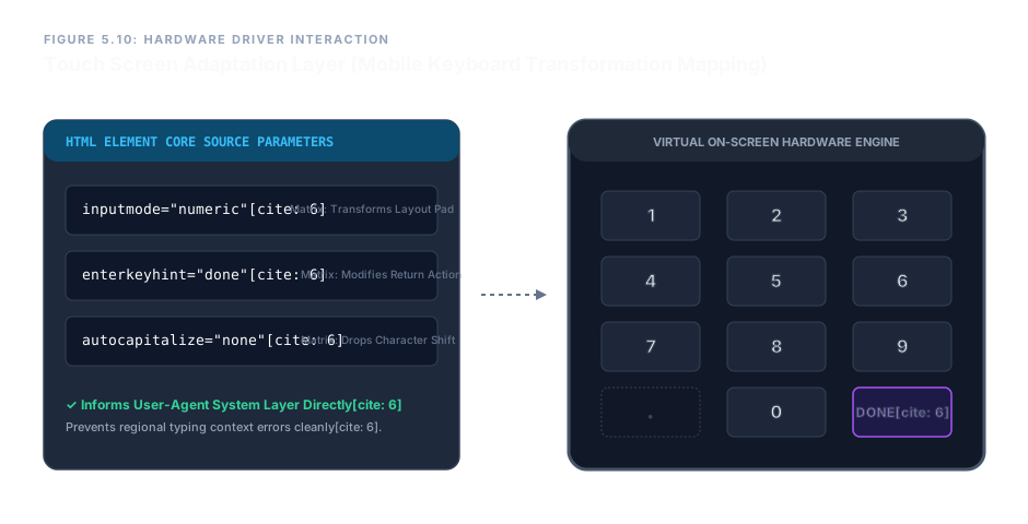
Mobile Keyboard Adaptation
On touch‑screen devices, three attributes fine‑tune the on‑screen keyboard for the expected input. These hints dramatically reduce typing errors and speed up data entry.
inputmode – Keyboard Layout
- numeric – full number pad (for PINs, IDs).
- decimal – numeric pad with a decimal point.
- tel – phone keypad with *, # keys.
- url – keyboard with forward slash and .com shortcuts.
- email – keyboard with @ symbol.
- search – keyboard with a search/enter button.
<input type="text" inputmode="numeric" placeholder="PIN only">
enterkeyhint – Action Button Label
Changes the label on the virtual keyboard’s enter key. Common values: go, send, search, done, next.
<input type="text" enterkeyhint="done">
autocapitalize – Automatic Capitalization
Controls whether the device auto‑capitalises the first letter. Use none for usernames, emails, and codes.
<input type="text" autocapitalize="none">
Enterprise Cluster Management Dashboard – A Complete Blueprint
The form below assembles every modern input type, plus selection controls, a datalist, and mobile optimisations, into a realistic administrative panel.
<form action="/api/control" method="post" id="system-panel">
  <fieldset>
    <legend>Enterprise Cluster Management Dashboard</legend>

    <label for="maint-date">Target Maintenance Date</label>
    <input type="date" id="maint-date" name="maintenance_date">

    <label for="panel-theme">UI Accent Color</label>
    <input type="color" id="panel-theme" name="panel_theme" value="#4ea8de">

    <label for="cpu-limit">Max Core Allocation Threshold</label>
    <input type="range" id="cpu-limit" name="cpu_capacity" min="10" max="100" step="5" value="40">

    <label for="db-location">Database Target Region</label>
    <input type="text" id="db-location" name="database_region" list="region-options">
    <datalist id="region-options">
      <option value="US-East">
      <option value="EU-West">
    </datalist>

    <fieldset>
      <legend>Security Logging Protocols</legend>
      <input type="checkbox" name="system_protocols" value="alpha" id="chk-alpha" checked>
      <label for="chk-alpha">Alpha</label>
      <input type="checkbox" name="system_protocols" value="beta" id="chk-beta">
      <label for="chk-beta">Beta</label>
    </fieldset>

    <fieldset>
      <legend>Deployment Target</legend>
      <input type="radio" name="env_target" value="production" id="rad-prod" checked>
      <label for="rad-prod">Production</label>
      <input type="radio" name="env_target" value="staging" id="rad-stage">
      <label for="rad-stage">Staging</label>
    </fieldset>

    <label for="log-month">Archival Month</label>
    <input type="month" id="log-month" name="archive_month">

    <label for="back-time">Daily Backup Time</label>
    <input type="time" id="back-time" name="backup_time">

    <label for="auth-token">Secure Passcode</label>
    <input type="text" id="auth-token" name="verification_code"
           inputmode="numeric" enterkeyhint="done" autocapitalize="none">

    <input type="submit" value="Transmit Command Matrix">
  </fieldset>
</form>This blueprint brings together date and time selectors, a color picker, a range slider, checkbox and radio groups, a datalist, and mobile‑optimised fields – all wrapped in a clean, accessible fieldset structure. The result is a modern, interactive control panel built entirely from native HTML, with no external libraries required.
Modern HTML input types give you powerful native widgets – calendars, color wheels, sliders – without JavaScript. Checkboxes and radio buttons provide flexible selection patterns. Datalists offer unobtrusive autocomplete. And with inputmode, enterkeyhint, and autocapitalize, you can shape the mobile keyboard to match your data, cutting errors and speeding up input. Together, these tools create a rich, responsive form experience that works across every device.