6.1 — Images & Media Asset Routing Pipelines
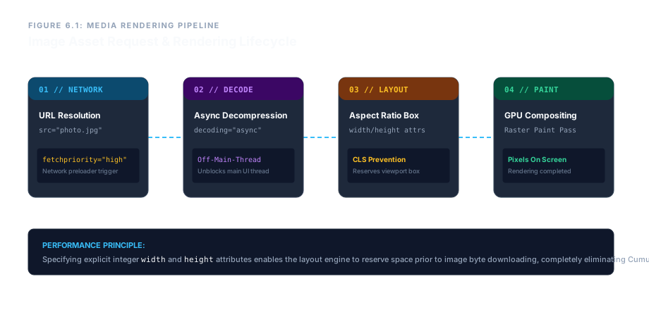
The <img> element is the gateway to visual media on the web. A void element with no closing tag, it instructs the browser to fetch, decode, and render graphics – from raster photos to vector illustrations. Mastering its attributes is essential for performance, accessibility, and responsive design.
The Core Attributes: src and alt
The src attribute (source) is the URL of the image file. It can be an absolute URL (starting with https://) or a relative path. The alt attribute provides a text description for screen readers and is displayed if the image fails to load.
<img src="photo.jpg" alt="A mountain landscape at sunset">

For purely decorative images, use an empty alt (alt=""). This tells the accessibility tree to skip the image entirely, preventing unnecessary announcements.
Absolute vs. Relative Paths
An absolute URL points to a resource on a different domain and includes the protocol. A relative path points to a file within the same project, using directory traversal tokens.
- Same folder:
image.pngor./image.png - Sub‑folder:
assets/image.png - Parent folder:
../shared/image.png - Root‑relative:
/images/logo.png
Preventing Layout Shift: width and height
Always include the image’s intrinsic dimensions as plain integer attributes. This allows the browser to reserve the correct space before the image loads, avoiding Cumulative Layout Shift (CLS). Do not include units.
<img src="banner.png" width="800" height="450" alt="…">
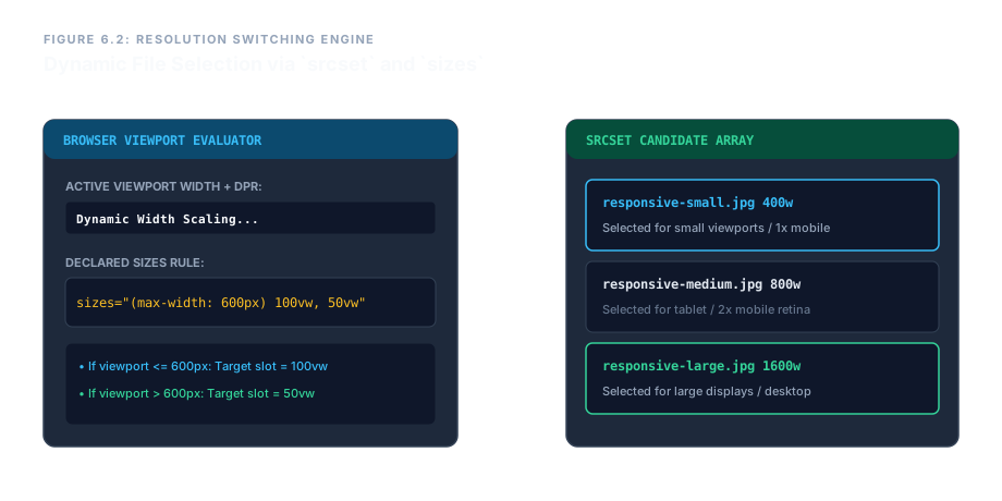
srcset and sizes enable resolution‑switching. (SVG diagram)Responsive Resolution Switching: srcset and sizes (Live Preview)
Below is a live example using three different image sizes. Resize your browser window to see which image the browser loads.
<img src="responsive-default.jpg"
     srcset="responsive-small.jpg 400w,
             responsive-medium.jpg 800w,
             responsive-large.jpg 1600w"
     sizes="(max-width: 600px) 100vw, 50vw"
     alt="Responsive example">
Right‑click the image and select “Open Image in New Tab” to see which file was loaded.
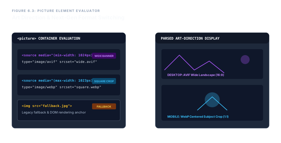
<picture> – different crops for different screens. (SVG diagram)The <picture> Element: Format Switching & Art Direction (Live Preview)
The <picture> container holds multiple <source> elements and a fallback <img>. The browser picks the first <source> that matches the media query and supports the image format.
<picture>
  <source media="(min-width: 1024px)" srcset="wide.avif" type="image/avif">
  <source media="(max-width: 1023px)" srcset="square.webp" type="image/webp">
  <img src="fallback.jpg" alt="Adaptive image">
</picture>
This pattern allows you to serve a modern, highly compressed AVIF or WebP file to browsers that support it, while providing a standard JPEG fallback. The media attribute enables art direction – completely different image crops for mobile vs. desktop.
Performance Attributes: loading, decoding, fetchpriority
- loading="lazy" – delays image download until it’s near the viewport. Use for off‑screen images.
- loading="eager" – (default) loads immediately. Use for above‑the‑fold hero images.
- decoding="async" – decode the image off the main thread, preventing jank.
- fetchpriority="high" – hints to the browser that this image is critical and should be prioritised.
<img src="hero.jpg" loading="eager" fetchpriority="high" decoding="async" alt="…">
Enterprise Production Blueprint – Fully Optimized Media Pipeline
The following snippet assembles every concept into a real‑world, production‑ready media element. It uses an art‑directed <picture> with AVIF/WEBP sources, responsive sizes, explicit dimensions, lazy loading, and a detailed alt text.
<picture>
  <source media="(min-width: 1024px)"
          srcset="https://cdn.enterprise.com/assets/telemetry-wide.avif"
          type="image/avif">
  <source media="(max-width: 1023px)"
          srcset="assets/mobile/telemetry-square.webp"
          type="image/webp">
  <img src="../../fallback-core.jpg"
       width="800" height="450"
       srcset="fallback-mobile.jpg 400w, fallback-desktop.jpg 800w"
       sizes="(max-width: 600px) 100vw, 50vw"
       loading="lazy"
       decoding="async"
       alt="Comprehensive production analytics dashboard grid display mapping real-time system resource allocation datasets">
</picture>
Resize the window or open the page on different devices to see the image change.
This blueprint combines every performance and accessibility best practice into a single, reusable component. The result is a fast, stable, and inclusive visual experience.
Images are more than decorative graphics – they are a cornerstone of web performance and accessibility. Always provide a meaningful alt text, hardcode width and height to prevent layout shifts, and use srcset/sizes for responsive delivery. For advanced use cases, leverage the <picture> element for format switching and art direction. With these techniques, your media will load fast, look sharp on every device, and remain fully accessible.