11.1 — The Accessibility Tree & Implicit ARIA Roles
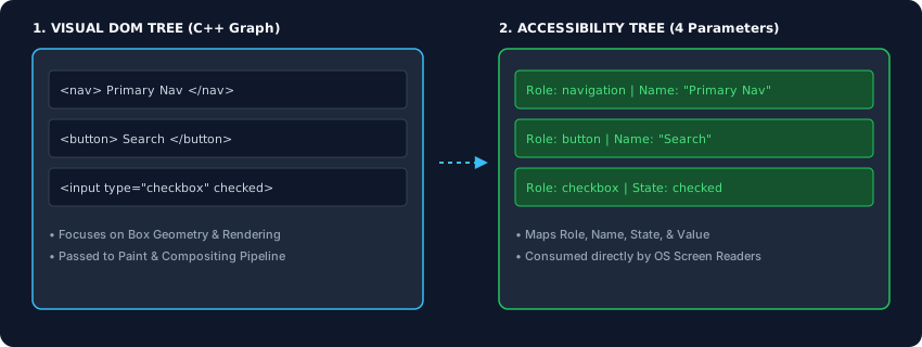
The visual viewport shows only half the browser’s output. Behind the scenes, a second tree – the accessibility tree – maps every element to a role, name, state, and value. Understanding how this tree is built, how native HTML semantics provide implicit ARIA roles, and how to supplement with explicit ARIA attributes is the key to building truly inclusive applications.
The Four Parameters of Every Accessibility Node
For every element that survives the filtering process, the browser computes an accessibility object with four core properties:
- Role – what the element is (button, heading, checkbox, navigation).
- Name – its text label, computed from content or attributes.
- State – live status flags (expanded, checked, disabled, focused).
- Value – the current data payload (e.g., the number inside a range slider).
These four parameters are what screen readers and other assistive devices consume. If your HTML is semantically broken, the accessibility tree will be too, rendering the page unusable for a significant portion of users.
Implicit ARIA Roles – The First Rule of ARIA
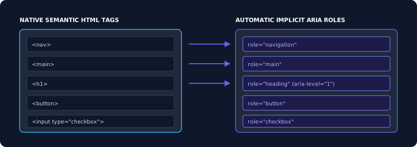
Every valid HTML element has a built‑in, hardcoded ARIA role – an implicit ARIA role. For example:
<nav>→ navigation<main>→ main<h1>‑<h6>→ heading (with a level attribute)<button>→ button<input type="checkbox">→ checkbox
Because these roles are part of the C++ engine, they work reliably across every browser and operating system. Never duplicate them with explicit ARIA: writing <nav role="navigation"> is redundant and error‑prone. Even worse is overriding a native element’s role with a manual one, like turning a <div> into a button with role="button" – it will lack keyboard focus and event handling unless you add extensive scripting.
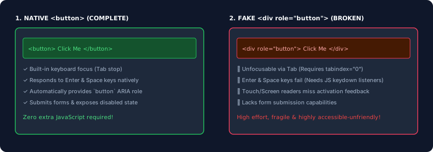
<button> provides keyboard interaction for free; a <div role="button"> does not.Advanced ARIA: Labels, Descriptions, and Live Regions
When native semantics need a supplement, three powerful ARIA tools come into play.
aria‑label – Direct Accessible Name Override
When an interactive control has no visible text (e.g., an icon button), use aria‑label to provide a name that screen readers will announce.
<button aria‑label="Search">🔍</button>
aria‑describedby – Contextual Description Link
Link a control to a separate element that contains detailed instructions. The browser will read the label first, then the associated description.
<input type="password" id="pass" aria‑describedby="pass‑help">
<p id="pass‑help">Must be at least 8 characters.</p>
aria‑live and aria‑atomic – Dynamic Content Announcement
For content that updates without a page reload (error messages, live counters, notifications), wrap it in a container with aria‑live="polite" (queues the announcement) or aria‑live="assertive" (interrupts immediately). Add aria‑atomic="true" to force the engine to re‑read the entire region, not just the changed portion.
<div aria‑live="polite" aria‑atomic="true">Shopping Cart: 3 items</div>
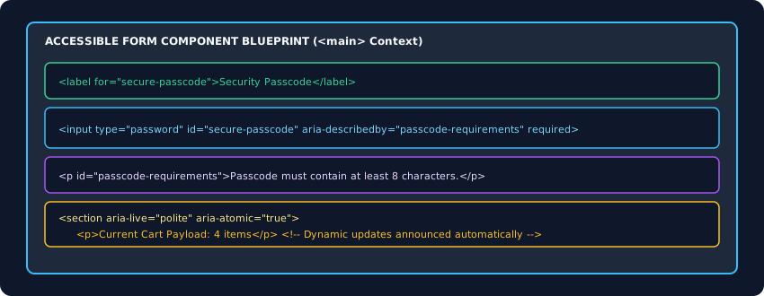
Enterprise Blueprint – An Accessible Form with Live Feedback
The following markup assembles a secure password field with an accessible label, a linked description, and a live region that announces updates. Every tag pair was initialised before attributes were added, ensuring a perfectly balanced structure.
<main>
  <div class="console-field">
    <label for="secure-passcode">Security Passcode</label>
    <input type="password" id="secure-passcode" required
           aria‑describedby="passcode-requirements">
    <p id="passcode-requirements">Passcode must contain at least 8 characters.</p>
  </div>
  <section aria‑live="polite" aria‑atomic="true">
    <p>Current Cart Payload: 4 items</p>
  </section>
</main>Passcode must contain at least 8 characters.
Current Cart Payload: 4 items
This component is fully accessible: the label is programmatically linked, the input carries a description, validation is enforced natively, and live updates are announced without visual disruption.
The accessibility tree is the semantic twin of the DOM. Rely on native HTML elements for their implicit ARIA roles; supplement with aria‑label, aria‑describedby, and aria‑live only when necessary. Always test your pages with an accessibility inspector. When you build with this mindset, your applications become not just visually stunning, but genuinely usable by everyone.