5.2 — Labels & Fieldsets
Form controls are useless without context. The <label> element forges an unbreakable bond between a text description and its input, while <fieldset> and <legend> group related controls into clear, accessible sections. Together they create a form that is usable, navigable, and testable.
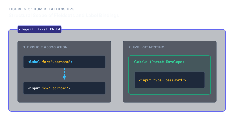
The Label Element – Two Association Methods
A <label> provides a clickable text caption for a form control. It improves usability (larger hit area, especially on mobile) and tells screen readers which description belongs to which input. There are two ways to connect them:
1. Explicit Association (Gold Standard)
The label and the input are separate elements. They are linked by matching the label’s for attribute to the input’s id. This is preferred in large projects because the label can be placed anywhere in the DOM and still work.
<label for="username">User Name</label>
<input type="text" id="username" name="user">
When you click the label text, focus jumps into the input. The id must be unique on the page.
2. Implicit Association (Structural Nesting)
Here, the input is placed directly inside the label element. No for or id attributes are required, but this approach is less flexible if you need the label and input to be visually separated by other elements.
<label>
  Password
  <input type="password" name="pass">
</label>Grouping Controls with <fieldset> and <legend>
When a form grows to dozens of inputs, grouping related controls makes it easier to understand, maintain, and test. The <fieldset> element creates a visual and semantic boundary around a set of controls. Its first child should always be a <legend>, which provides a caption for the group.
<fieldset>– a container for a logical group of form elements.<legend>– a title for the fieldset; must be the first child. Only one is allowed per fieldset.
<fieldset>
  <legend>Account Details</legend>
  <label for="fname">First Name</label>
  <input type="text" id="fname" name="fname">
  <label for="lname">Last Name</label>
  <input type="text" id="lname" name="lname">
</fieldset>Screen readers will announce “Account Details, group” when entering the fieldset, giving immediate context. Multiple fieldsets can be used on one page.
The disabled Attribute on a Fieldset
Adding the boolean disabled attribute to a <fieldset> instantly disables every input, label, and control inside it. This is a powerful block‑level switch – no need to disable each element individually.
<fieldset disabled> … </fieldset>
All controls are greyed out and excluded from form submission. This is perfect for temporarily blocking a section during a workflow.
A Complete Grouped Section
The following snippet combines explicit labels, fieldsets, and legends into a realistic address form segment. Notice how the structure guides both the eye and the screen reader.
<form action="/update" method="post">
  <fieldset>
    <legend>Shipping Address</legend>
    <label for="addr-line1">Address Line 1</label>
    <input type="text" id="addr-line1" name="line1">
    <label for="addr-city">City</label>
    <input type="text" id="addr-city" name="city">
  </fieldset>
</form>Every control is explicitly linked, and the fieldset provides a clear structural anchor. This pattern scales effortlessly to forms with hundreds of inputs.
Never leave an input without a label. Use explicit for/id associations for maximum flexibility. Group related controls inside <fieldset> with a <legend> to create logical sections. When needed, disable an entire group with a single disabled attribute on the fieldset. These practices turn a raw list of inputs into a professionally structured, accessible, and maintainable form.