10.6 — The Dual Viewport Specification
On a desktop, the browser window’s width and height directly define the rendering space. But on mobile, the physical screen is too small for the desktop‑sized web. The solution is a two‑layer system: the layout viewport (the virtual canvas) and the visual viewport (what you actually see). Understanding this split is the key to building fluid, responsive designs.
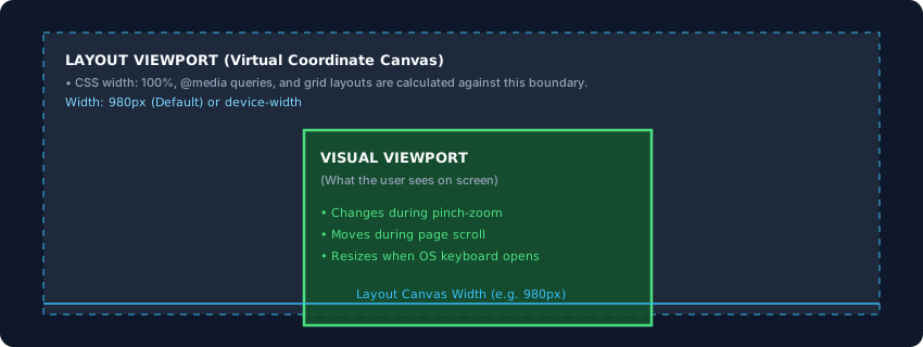
Layout Viewport – The CSS Sandbox
The layout viewport is the virtual coordinate space where all CSS calculations happen. When you set width: 100% or use a media query like @media (max‑width: 768px), the browser evaluates those numbers against this viewport. It is the sandbox that the entire layout engine lives in.
Under normal desktop conditions, the layout viewport equals the visual viewport. But on mobile, the layout viewport is often larger than the physical screen – a legacy workaround that makes desktop‑sized pages fit without breaking.
Visual Viewport – What the User Actually Sees
The visual viewport is the current visible portion of the page on the device screen. It changes when the user zooms, scrolls, or rotates the device. When you pinch‑zoom into a paragraph, the visual viewport shrinks to focus on that area, but the layout viewport remains unchanged – no reflow, no wrapping. The engine simply magnifies the already‑calculated pixel map within the visual viewport.
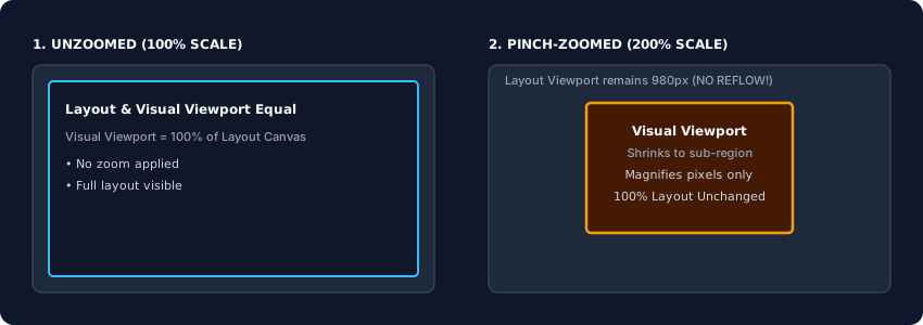
The 980‑Pixel Legacy Default
When smartphones first appeared, most websites were designed for screens around 980‑1024 pixels wide. To avoid breaking every existing site, mobile browser vendors hardcoded a default layout viewport width of 980 pixels. The browser would lay out the page as if it had a 980‑px‑wide screen, then shrink the entire result to fit the tiny physical screen – like a photograph scaled down. This is why desktop sites look microscopically small on a phone until you zoom in.
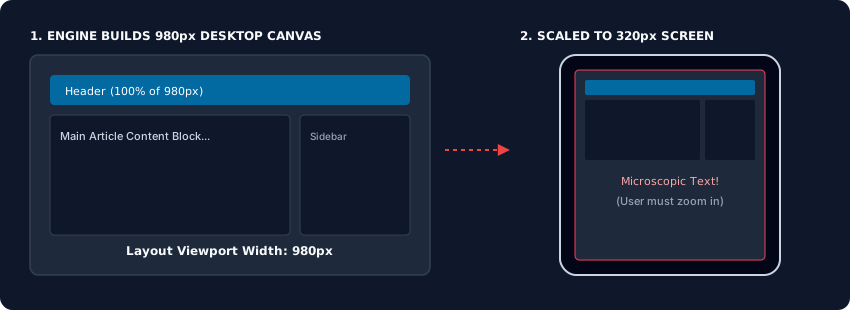
Taking Control: The Viewport Meta Tag
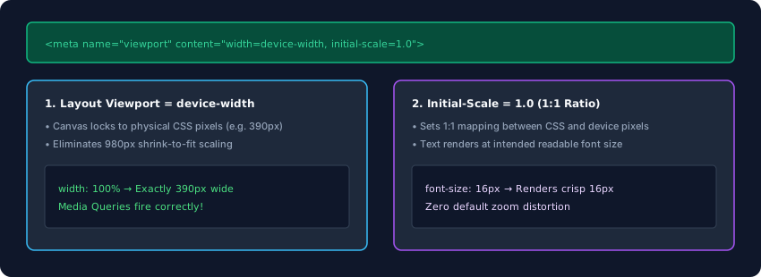
To override the 980‑px default and enable responsive design, you inject a <meta name="viewport"> tag inside the <head>. The standard declaration is:
<meta name="viewport" content="width=device-width, initial-scale=1.0">
width=device‑width forces the layout viewport to match the device’s independent pixel width – not the physical resolution, but the CSS‑pixel width. On a phone with a CSS pixel width of 390 px, the layout viewport becomes exactly 390 px wide.
initial‑scale=1.0 sets a strict 1:1 mapping between CSS pixels and device pixels. It disables the automatic shrink‑to‑fit behaviour, so the page appears at its intended size. Media queries now fire correctly, percentages translate to actual screen space, and text remains legible without zooming.
The layout viewport is the CSS engine’s canvas; the visual viewport is the physical window. Mobile browsers default to a 980‑px layout viewport for legacy compatibility, but the <meta name="viewport"> tag overrides that default. Always include width=device-width, initial-scale=1.0 in your head to align the virtual canvas with the actual screen. This tiny line unlocks responsive design and ensures your layouts behave exactly as you intend on every device.